
To start with I created the cover grid on InDesign so when I have finished the Photoshop elements, I can transfer them straight over. When the rulers were in place, I could tell that the measurements were correct.


From my research it was clear that floral covers are popular for fiction titles, predominantly hardbacks:


In order to aim towards an adult audience, I think this effect would prove to be effective, considering the stories orient around the topic of nature. I sourced three images; the butterflies are photos from http://www.arcangel.com and the bunch of flowers is a photo I took myself. The idea is to have the title prominent on the page and the flowers in the background, protruding out in front of the text. The butterflies will be scattered on the flowers and could protrude in front of the text aswell.


To make the effect I cut around the floral part of the bouquet with the magic wand tool and transferred it onto the black background. I then duplicated the flower layer and added a layer mask and filled it in black. I then added the text in American Purpose font; it is bold and graphic but has a softer edge to it. I moved the text between the two layers and reduced the opacity. To make some of the petals protrude over the text, I chose the brush tool and changed the colour to white and then painted over the areas to overlap the text.

In order to make the flowers more 3D, I CTRL + clicked the layer mask thumbnail on the flower’s duplicate layer. I created a new layer and filled it in black then converted it to a smart object and added a gaussian blur of 7. Nudging it slightly downwards made it look like a realistic shadow. I cut out the butterfly pictures and placed them around the text, and added the authors name in Rockness font that looks handwritten, almost like an autograph. The final image looks as below.

I approached Ness for some feedback on the design and she suggested making the text much biggger and align the ‘Stories’ so it fit under ‘Just So’. I was unsure whether it was fine to split up the word ‘Stories’ but Ness liked how it looks and said this is quite a common design effect. She added extra guidelines to line up the text and suggested surrounding the cover with more flowers and butterflies to create a ‘world’ rather than just having flowers alone in the middle of the page. I liked how the text looked in a larger size. This is how it looked when Ness made the ammendments:

Now I need to make the amendments in my file. I took further photos of the bunch of flowers to add around the edge and scanned in some leaves for variety.


I realised that in the Photoshop document I hadn’t allowed 5mm bleed around the edge, which is important when it comes to transferring the document over to the InDesign document, and the 3mm on the top and bottom for a hardback cover as it is always bigger than the TPS. This was the main obstacle in the process of design.
After adding further imagery, I played around with positioning for a while and found this the best positioning for the front cover:
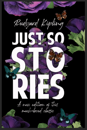
There is extra space at the right to account for the turnaround of the page. Next I made the spine. I decided to keep it simple as the cover has a lot of detail. I took the butterflies from the front cover and placed them at the top of the spine. This is the photoshop document:

I will add the text in the InDesign later. The next job is to make the back cover. I thought I would encorporate some of the elements from the front cover to frame the back cover. When it came to making the barcode, I realised that it may look too obvious and out of place on a black background. I made a white background for the barcode and then scuffed the edges using a brush on the eraser tool. I think the effect looks good and hiding it behind elements such as the butterfly helps it to look a part of the image. 
For the flaps, the photoshop elements were quite simple. On the left flap, there will be a small biography of Rudyard Kipling. I sourced an image of him in an oval frame and will add text later, the right flap I added a flower to flow the theme over the cover. This flap will include a description of the story. After adding all the Photoshop documents to the InDesign document, I was happy with how it looked.
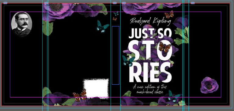
I then added the copy. At first I chose a font for the copy but that meant that I had encorporated three different animated-lookin fonts so it looked messy. I ended up with three fonts in the end but the font for the copy, Althea, is less animated than the previous choice. I originally chose the spine to feature the same font as the title but it looked quite clunky so I decided to use the Rockwell script font which looks handwritten and it looks more subtle yet still stands out well. I looked at various hardback covers for guidance on where to place the copy. I chose a quote from the book for the backpage as the blurb is on the inside flap, along with the author biography.

Finally, I decided to look at dfferent finishing options. As the title is being produced on a relatively small budget, I decided to pick just spot UV for emphasis on the title and the main bunch of flowers. This is the spot UV guide:

Conclusion
I am very happy with the final book cover. I feel that it is reflective of some of the titles that are available in bookshops currently. Throughout this assignment my skills as a designer have developed massively. I have learned new skills by practicing and trying out new things. If I were to do it again I would definitely not rush through things, and make sure that I keep my files organised as throughout the process I feel I was wasting time looking through folders for where my images were. In industry this would not be acceptable. I also feel that an illustrated cover would have been effective in this style, so if I were to have the resources, I would commission an illustrator to do the floral pieces and the butterflies. It would give it a slightly more magical effect.
 Abby's Publishing Skills Log