
First I set up the grid on InDesign to the same dimensions as the fiction book we practiced on in our typesetting class. I went through and proofread the document. This involved changing double spaces to single spaces, checking for tabs and spelling mistakes. Other errors that came up were extra spaces in the middle of words and extra line breaks in between sentences, speech marks used instead of apostrophe. The double spaces and tabs could all be changed at once but for the other errors I had to go through and check through myself. Having the show hidden characters feature on helped to spot these mistakes. This job is quite tedious but the features of InDesign mean that it isn’t a particularly long job.

I then set about choosing fonts. In order to fit in with Jacqueline Wilson’s style, I chose a handwritten font, reflecting a young, teenage handwriting. I also looked for a font that would be likely written by a girl, as opposed to the font used in The Diary of a Wimpy Kid. The font I chose for the body text was neat but clearly handwritten.
For the sections of text that introduce the writing, I thought a similar font would be fitting and chose a handwritten looking capitals font. Therefore the questions will stand out from the answers and make it easy to read. For the chapter headings I chose Vintage Display which also looks hand drawn but more bold and eyecatching for a header. It looks as if a child has done bubble letters and shaded them in so it looks like a doodle notebook. 


I then began making the paragraph styles for the different parts of text:
- Body text: Please write me a song, size 16, leading 16
- Paragraph heading: Vintages, size 16, leading 16
- Chapter title: Vintage Display, size 16, leading 16
After choosing an appropriate size and leading, I made a baseline grid. To do this I set the grid to 20 leading to make it slightly more spaced out to make it readable for a younger reader. 
To make the text adjust to the grid I pressed this button:

I went through to check that everything was in the right font and size, and fit to the baseline grid. A few occasions the font was smaller so it was good that I checked through. The font that I have chosen doesn’t feature an italics option. Therefore, in order to create the effect of italics, I made the word in a separate text box and from there I skewed the text enough to make italics:

I then realised that I can have more than one font in a text box so transferred this small text box into the main body text. This makes the InDesign file less messy and easier to navigate. If I were to change the images around I would risk losing the small text box.
I then thought stylistically how to make it more interesting. From the research on other similar titles, I found that many had lines on the page as if written on lined paper. I found this effective for a diary-style novel with handwritten font. It took some time to work out how to achieve this effect. There are fonts available with lines already included but the lines didn’t reach the end and it looked disjointed. Therefore I decided to draw the lines following the baseline grid, but on the master page so it would apply to all of the pages. 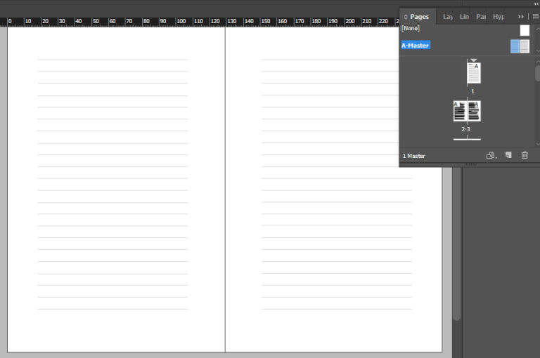
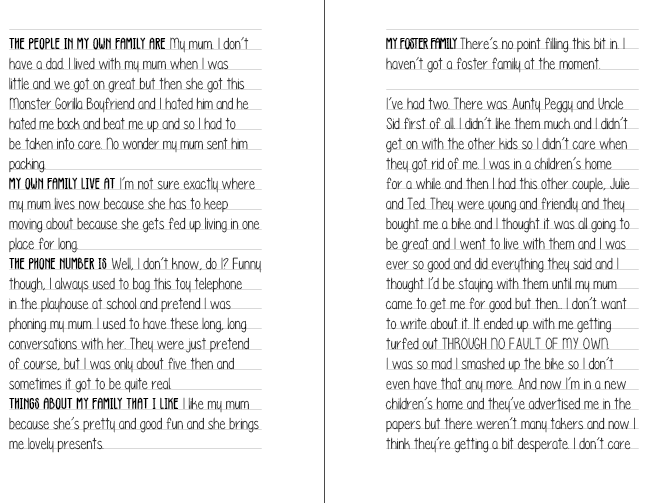
I found it much easier and quicker to achieve this effect than I originally thought and I think it looks great and matches the style of the text well. The next task was to make the page numbers.
I went into the master page and made a text box at the bottom of each page and went to Type > instert special character > markers > current page numbers. I set the text to Please write me a song in size 16, the same as the body text.
Placing Images
To begin with, as there were images with more than one illustration, I cropped the pictures so it would be easier to place the images separately. I started at the beginning so I could re-format any orphans and widows in the text as I go. The images had a lot of white space around them which would get in the way of the lined-paper effect that I have gone for. Therefore when placing the images I went to Clipping path > Detect edges.
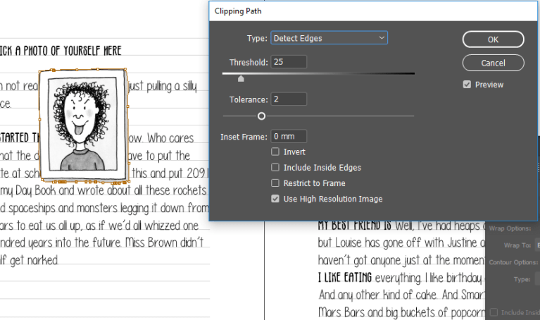
To then make the text wrap around the image I clicked the text wrap button and moved the image around to where it fit best on the page and linked to the writing.
Reviewing the text so far
To get a better idea of how the text will appear, I printed off an example page of the text to make sure that the font was right, it was big enough and the text had enough leading. 
Looking at the page, I could see that the text is too small and there is not enough leading, especially for the age group of the reader. I went back and changed this in order for it to be more readable. This proved to be quite a time consuming task. I needed to change the size and leading of the font, then adjust the baseline grid, then adjust the lines accordingly. In hindsight, I should have printed out the document before placing the images which is something I will remember in the future.
Before I did all this though, I removed the lines and hid the baseline grid, then changed the font size to 20 and the leading to 25 and printed the page out to get an idea of the sizing before spending time changing everything else.

I think this is a much better size and is much more readable. I then went through and added the baseline grid and the lines, and rearranging images.
I came across an issue when reinstating the lines in the background using the master page. When I was inputting images, I had been wrapping the text, so when I came to adding the lines on the master pages the, it was wrapping the text around the lines. When I came to check the main text, all of the writing had gone. It took some time to realise it was because of the text wrapping option I had selected. It is typical to encounter issues like this but in the end it helps to develop my skills and learn new features of the program.
As a final check, I went through making sure there were no words carried onto two lines, or any orphans and widows. I came across a few and tweaked the images or changed the tracking of the text so that the single word could fit on the line.

Conclusion
Although I found this assignment challenging and there were obstacles to overcome, I feel that my grasp of InDesign is stronger and I have a better understanding of the typesetting process.
I feel that the finished product ties in the aesthetic of Jacqueline Wilson’s work with features used in popular middle-grade books available today. I like how it is updated yet still remains true to the author’s style. I am proud of myself for trying a new effect with the lined paper as it wasn’t an easy task, but perserverence made it so I have an effective finished product.
 Abby's Publishing Skills Log